Microapp pictures look like nothing else. They're warm, hand-drawn, faintly editorial — closer to a Penguin paperback than to corporate-stock vector clip-art. This chapter is the canonical reference: the style, the rules, the existing library, and how to make a new illustration that lands in the same family.
If a picture could plausibly appear on the Salesforce homepage, it doesn't belong on ours.
The rules
Every Microapp illustration — whether a WebP scene or an inline SVG primitive — follows the same six rules. They are non-negotiable. Drift on any one and the picture stops looking like Microapp.
- Bold dark outline.
Every shape carries a
#1B3A1Bstroke. Thickness3–4pxfor hero shapes,2–2.5pxfor inner detail,1.5pxfor fine work. Outlines are the brand's signature — they read as confidence, not delicacy. - Rounded corners, rounded everything.
Hard 90° corners are forbidden. Cards round at
rx 8–22. Buttons and pills go to9999px. Even speech bubbles round. The brand has soft edges by design — premium without being sharp. - The palette is locked.
Forest green (
--color-brand-forest) and gold (--color-brand-gold) lead. Lime green (--color-brand-lime) is the accent. Cream (--color-brand-paper) is the background. Coral (--color-brand-coral) appears only as a small spark of warmth. Skin tones use natural ranges (#FFDBB5warm, plus deeper tones — never one tone for all characters). - Hand-drawn, not vector-perfect.
Slight imperfection is the look. Slopes wobble a degree, weights vary slightly between strokes, characters have asymmetric pupils. Pictures should look made-by-a-human, even when they're not. Avoid Adobe Illustrator's "precision" defaults — they read corporate.
- People are diverse and real.
Every scene featuring people includes a range of races, ages, and body types — without exception. No one ethnicity, age, or gender carries a scene alone. Speech bubbles use first-person ("I belong here!"), never third-person.
- Speech bubbles do the talking.
Brand pictures speak. Bubbles + clouds carry single-sentence lines in the brand voice (§6 Voice). Bubbles are always pointing to a face. Clouds float above and carry abstract truths ("Everything is possible.", "Built different."). Type inside bubbles is sans-serif bold — Plus Jakarta Sans 700+ or hand-lettered look.
Always
- Dark outlines on every shape
- Rounded corners on every rectangle
- Brand-palette fills only
- Diverse, recognizable adults
- Speech bubble or cloud where appropriate
- Slight hand-drawn imperfection
Never
- Gradients, shadows, or glow effects
- Photorealism or 3D-rendered look
- Stock-vector "tech bros at whiteboards"
- Single-tone humans (one ethnicity per scene)
- Light, hairline strokes (looks fragile)
- Out-of-palette accent colors
The editorial library
Seven hero illustrations form the brand's editorial vocabulary. Each one has a specific job — the same way Patagonia's "Don't buy this jacket" ad has a job. Use them where they fit; don't use them as decoration where they don't.
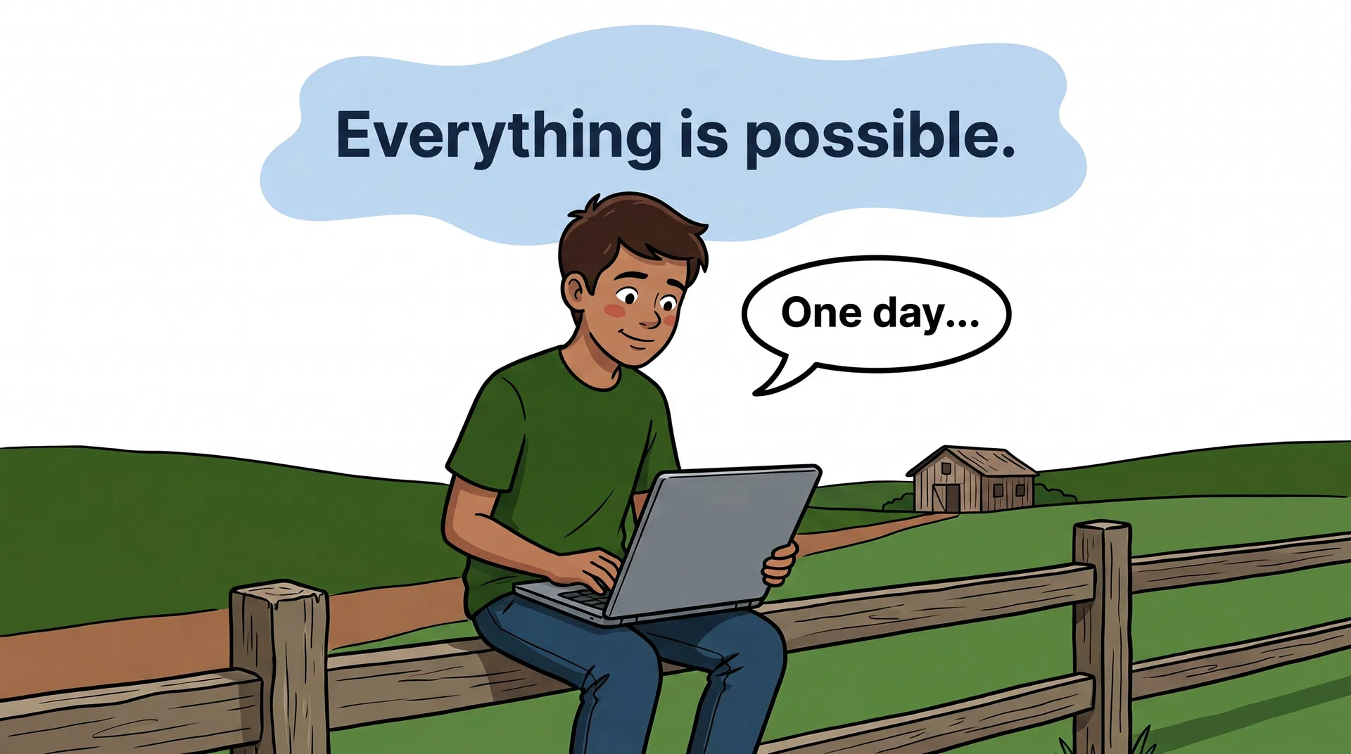
farm
A teenage boy from a Brazilian farm with a laptop showing the Microapp logo. Speech bubble: "One day…" Cloud: "Everything is possible."
Use for: Origin-story moments. The aspirational reader who hasn't started yet. Use for /about, the founder letter, signup-confirmation pages.
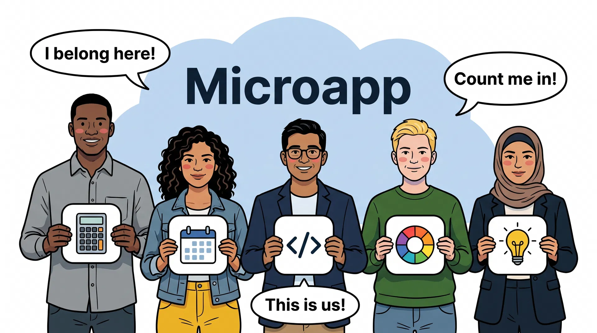
movement
Five diverse adults holding Microapp app icon cards. Speech bubbles: "I belong here!", "Count me in!", "This is us!"
Use for: Membership pages. "Who Microapp is for" sections. Community + belonging contexts. Don't use for AI/agent contexts (that's a different scene).
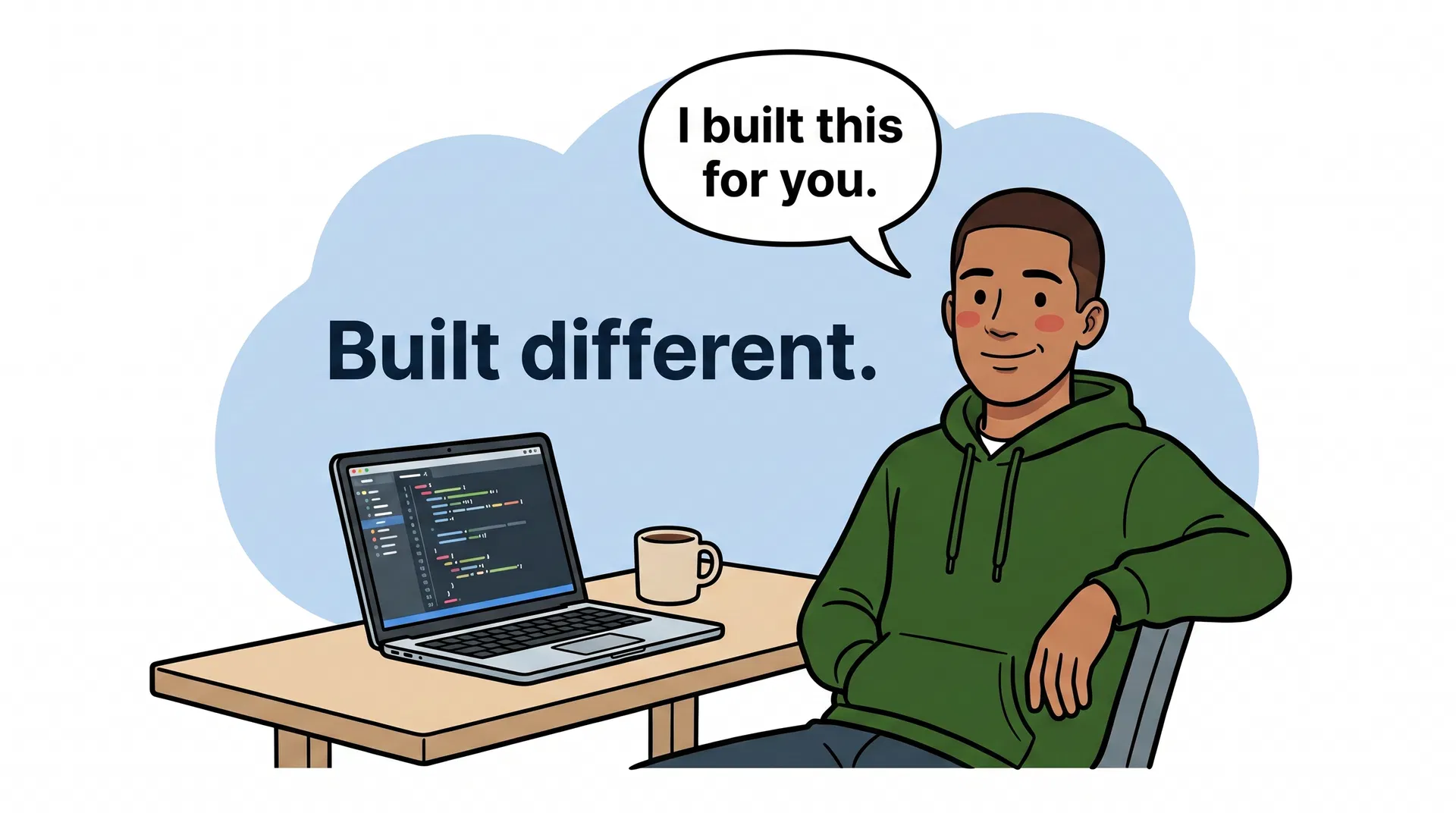
cool-nerd
Young adult founder in a forest-green hoodie at a laptop. Speech bubble: "Built different." Cloud: "Built by one person. For everyone."
Use for: Founder voice / one-person-company contexts. Internal docs, agent OS narrative, the "how we work" story.
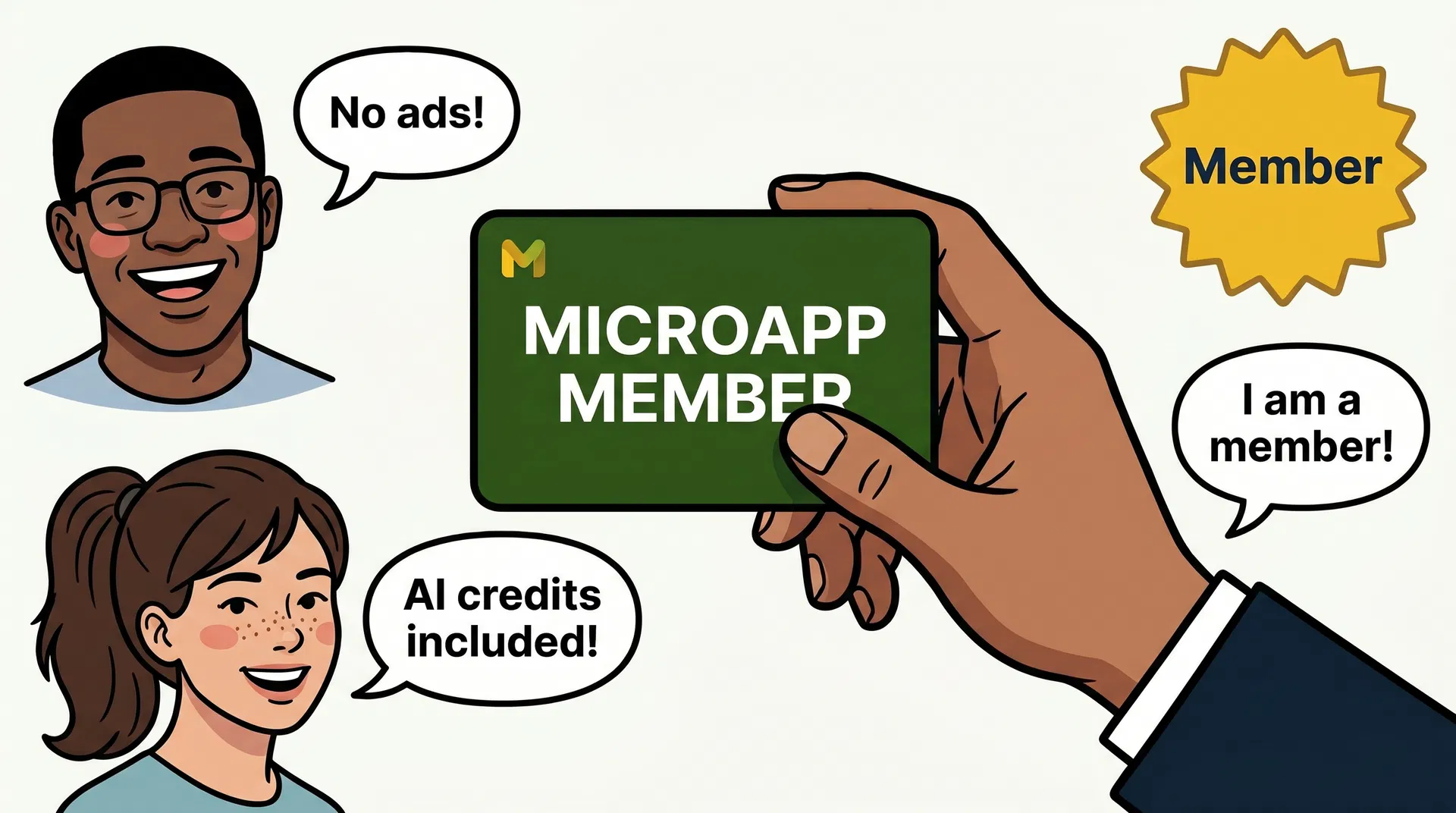
membership
An adult hand holds a forest-green Microapp Member card. Three diverse faces with speech bubbles: "No ads!", "AI credits included!", "I am a member!"
Use for: The /membership page. Member-benefit explainers. The Costco analogy in long-form copy. Specifically the moment we're naming what the card gets you.
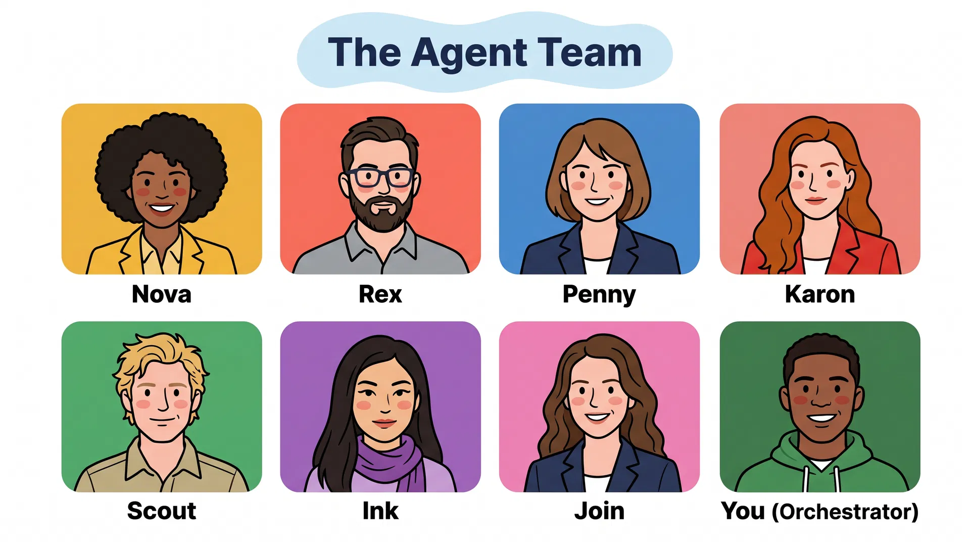
agents
Eight AI agent portrait cards (Nova, Rex, Penny, Karon, Scout, Ink, Join, You). Cloud above: "The Agent Team."
Use for: Agent OS context. The team page. "How the agents work" explainers. Never use this for non-agent pages — the cast read implies a system.
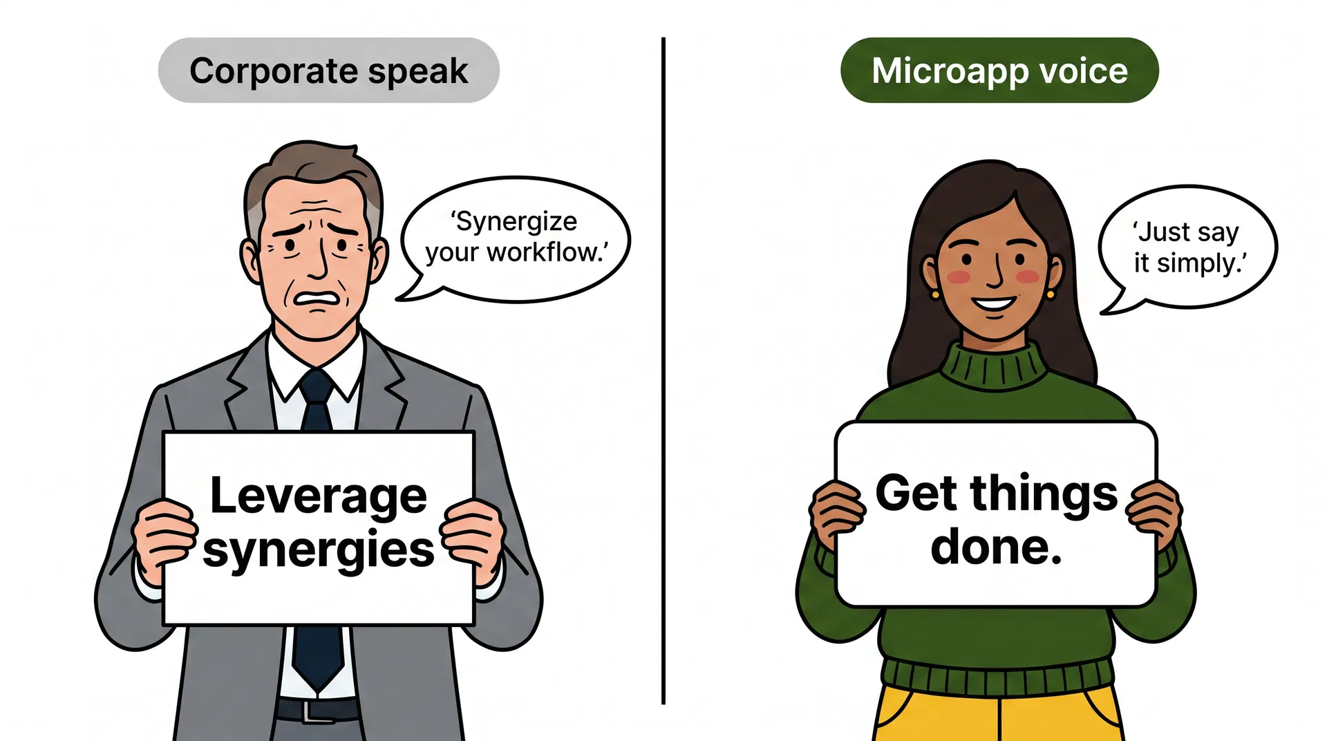
voice
Two characters side by side: Corporate-speak (stiff suit, "Leverage synergies") vs Microapp voice (green sweater, "Get things done."). Speech bubble: "Just say it simply."
Use for: The Voice chapter. Brand-onboarding for agents. Any time we're explicitly contrasting our voice against Big Software's.
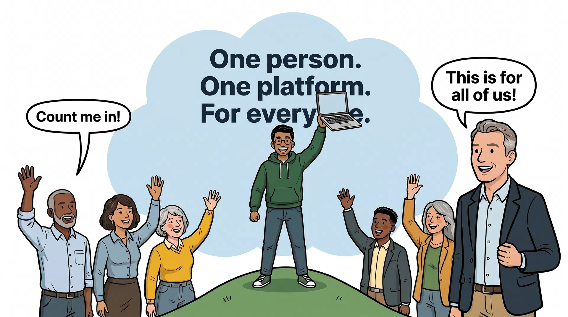
manifesto
The founder stands on a green hill, laptop held above their head. Cloud: "One person. One platform. For everyone." Crowd waves below: "Count me in!"
Use for: The manifesto. Founder letter. Press kit. The one image where the brand stands up and shouts — use sparingly so it stays meaningful.
SVG primitives
Inline SVGs used as decorative accents — for category cards, feature blocks, /agent-os and /system-design illustrations. Same rule set as editorial: dark outline, rounded shapes, brand palette only.
App icon
Cartoon face
Calculator
Shield
Color wheel
Code brackets
How to make a new one
Two paths. Pick by use case.
- Editorial hero (WebP) — for a full-page picture.
Generate with the same model and prompt family used for the existing seven. Prompt template lives with brand assets (see Daniel for the WebP source). Final asset uploaded to
d2xsxph8kpxj0f.cloudfront.netand dropped into the relevant page. Always include analtattribute that names what's in the picture (the existing seven model this). - Inline SVG primitive — for a category card, agent avatar, or feature accent.
Hand-author the SVG. Use
viewBox="0 0 120 120"as the default canvas (or80 80for avatars). Apply the six rules above. Fill viavar(--color-brand-*)tokens — never raw hex (thetests/brand-palette.test.tsguardrail will fail the build). Stroke is always#1B3A1B. Save next to the consuming component; if it's reused 3+ times, promote to a shared file. - Test the result against the rules before merging.
Read the six rules above. Walk through them one by one against the new illustration. If you can't honestly answer "yes" to all six, the picture isn't done yet — go back. Specifically: are there dark outlines on every shape? Are corners rounded everywhere? Is the palette pure? Are the people diverse?
The brand is what the brand looks like. Illustrations carry more weight than copy — they're felt before they're read.